In a comment to my last post, Jim Self noted that it's worth it to invest in covers--be it time or money.
I agree wholeheartedly, and I would throw in another thing you really should invest: Thought.
Thought was something I decidedly failed to invest when I released Trang. I released it with no cover at all, because I knew something deep down in my bones: A cover artist was going to take care of all that.
Didn't work out that way, did it?
The thing is, I'm actually happy I didn't pay someone to do the cover initially. Why? Because my concept was all wrong.
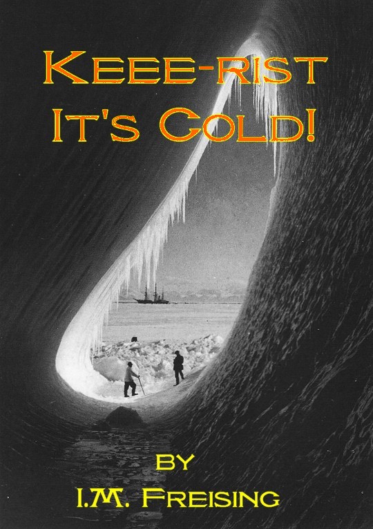
Here's that hideous cover I drew myself. (Warning: I cannot draw. At all. I have a seven-year-old niece who draws a THOUSAND times better than I do.)

If I had paid someone a lot of money for a well-drawn, far-prettier version of this cover, it would not have helped. Even with the horrible drawing, the cover was quite effective in communicating the idea that Trang is wacky adventure sci-fi, which it is not. Of course that upset readers who wanted that kind of book. If I had spent a lot of money, that would not have improved the fundamental problem in communication--indeed, it might have attracted many more people who were never going to like this kind of book.
Plus, if I had spent a lot of money on a beautiful version of the cover, I might not have scrapped that cover concept quite so quickly (loss aversion!). Not only did I save money, but I made it easier to test cover ideas and discard those that do not work. (Not that I realized it at the time.)
And as Lindsay Buroker discovered, you can have a professional cover that is technically excellent but that just does not get the job done--simpler is in many ways better.
Witness:
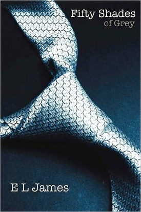
That's the power of good design right there--it's a very simple image and (I believe) a standard font, but the result is both eye-catching and suggestive of the book's content.
But what can you do if you aren't the least bit artistic?
Well, for starters I would question the idea that you aren't the least bit artistic. You have opinions, right? You can say "ugly!" and "pretty!" Certain things, you notice.
Take advantage of that fact. Notice what you notice.
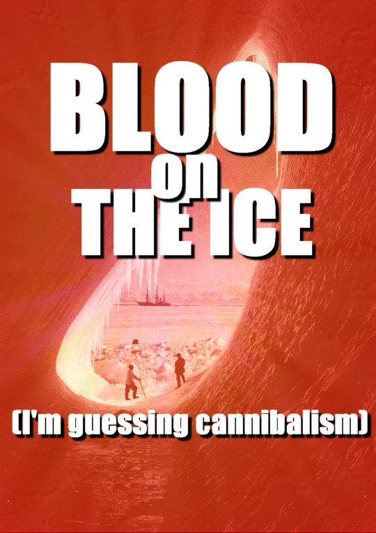
For example, Passive Guy recently linked to The Public Domain Review, which is seriously awesome. (Yeah, if you can't do anything when there's stuff like this and this and this and this out there, I can't help you.) He posted this picture:
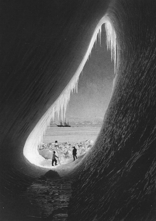
My first thought was, "That's eye-catching! That would make a great book cover"
Noodle with it a bit more, and it's a science-fiction cover!
Really, the possibilities are endless....

And this is just me screwing around for a little bit because I don't feel like tackling that layout. (I would noodle with the lettering to improve visibility if this was something that actually mattered.)
I'm not artistic. I don't even have real photo-editing software--just a freebie program that came with the computer I had before I got this one. Imagine what I could do if I had real software and actual talent, like Passive Guy and Barbara Morgenroth.
Both of them are also good photographers--I'm not, but I know a few good hobbyists, so I could crib off them. And basically, whenever anything catches my eye, I try to make note of what works, and if possible, how it works. (This is sometimes kind of a problem, because most visual artists aren't that good with words, so they often literally can't tell you what their process is.)
For example, if I was trying to put together a cover for a thriller, I would be cribbing big time from Carl Graves, Joe Konrath's cover artist. If you look at the way his lettering is positioned, he tends to guide the eye to the middle third of the book, and he'll even throw in some rays to pull it in. (Oh, and what's that I see on the photos? iStockphoto lettermarks!)